top of page


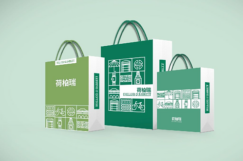
To support the expansion of the Holland & Barrett brand in China, we refreshed their packaging design. We created a series of unique icons, incorporating elements from both Chinese and British cultures and everyday life. These icons reflect Holland & Barrett's commitment to quality living and also convey a sense of local familiarity and approachability.
Our objective was to establish a stronger connection between the Holland & Barrett brand and Chinese consumers, helping to increase brand recognition and loyalty. By creating a visual identity that resonates with the local market, we believe that Holland & Barrett will be better positioned to achieve long-term success in China.


SEE MORE


bottom of page